Help Article
Form Designer - Field Settings

Who can use this feature?
By default, users with Admin role permissions
Purpose
When adding or editing fields in Form Designer, you can customize their behavior and appearance using Field Settings. Available settings vary by Field Type, and you can apply multiple settings where applicable to tailor each field to your specific data entry and reporting needs.
Start by adding or editing a field on your form. This will open a window where you can select a Type, then add new Settings.

The list of available Settings depends on which Field Type you select from the dropdown. (E.g., Chart vs. Number vs. Date.) Here's a quick overview of each Field Setting:

Field Settings
| Setting Name | Description |
| Auto Generate Only if Visible | Used to systematically assign a number only when the field is visible on the form. |
| Auto Generated | Used to derive a system assigned Activity Number for your Activity records. Can also be applied to any number field in order to provide systematic number. Can be set to assign numbers that are Unique by Form, Unique by Project, or Unique by Project and Form. If this setting is applied, set behavior exists that overrides the Hidden/Disable setting applied: - Field is disabled. - Field is hidden when a new record is being generated. - After record is saved, field will be visible, but no edits can be made. |
| Calculate If Hidden | Performs the underlying expression calculation if the field is hidden in a particular context. This only applies to the Hidden property and does NOT apply to a field that is hidden as the result of a visualization rule. |
| Chart Data Source | Use this setting to define the source of your chart data for a proctor curve (Chart field type). - Data Grid = The data grid your curve data comes from - X Coordinate Field = The grid field that contains the X coordinate (moisture) - Y Coordinate Field = The grid field that contains the Y coordinate (density) - Exclude Data Point Flag = Y/N field that is the flag indicating if a data point record should be excluded - The X/Y axis scale for each chart can be controlled on the individual charts for each form that is filled out. This is not a design component. |
| Chart - Scatter Plot Data Source | Use this setting to define the source of your chart data for your scatter plot chart. - Data Grid = The grid that contains your X/Y coordinate fields - X Coordinate Field = The grid field that contains the X coordinate - Y Coordinate Field = The grid field that contains the Y coordinate - Color = The color of the plot point and trendline for a given data series - Trendline Pattern = The pattern of the trendline (solid or dashed) - Legend Label = The label used in the legend to identify the data series - Exclude Data Point Flag = Y/N field that is the flag indicating if a data point record should be excluded - Multiple data series can be included on one chart if additional Data Source settings are added to the Chart - Scatter Plot field settings. |
| Chart - Scatter Plot Legend Position | Determines the position of the data series legend - below the chart or to the right of the chart. |
| Chart - Scatter Plot Logarithmic Scale | If set to TRUE, the X scale will display in a logarithmic scale (assume a base of 10). |
| Chart - Scatter Plot Scale Labels | Places an X and / or Y axis label on the chart. - X Scale Label = The X axis text label - Y Scale Label = The Y axis text label |
| Chart - Scatter Plot Sieve References | Places sieve size labels across the top of a chart. Includes a dashed blue line in the chart plot area as a reference point to the related sieve size. Data points do NOT need to exist for a given sieve size reference label to be used. |
| Chart - Scatter Plot Specification Fields | Use this setting to define the source of your material specification data / ranges - Data Grid = The grid that contains your material specification values (usually the same as your data source grid) - Low Spec Field = The grid field that contains the low specification value - High Spec Field = The grid field that contains the high specification value |
| Chart - Scatter Plot Title | Title for the chart. |
| Chart - Scatter Plot Reverse X Axis | If set to true the X axis will be reversed - descending order. |
| Chart - Scatter Plot Trendline Type | Trendline Type for the scatter plot chart - Linear = A linear trendline - Logarithmic = A logarithmic trendline - Polynomial = A polynomial trendline that can be defined to the 2nd, 3rd or 4th order - Smooth = A smooth trendline connecting plot points - Straight = A straight line connection between two data points - None = No line displayed between data points |
| Clear Upon Copy | Clears the field upon copying an existing form record into a new form record. Default behavior for all fields is to copy when the Copy Activity feature is used. |
| Column Width | Used in conjunction with the 'Display As Table' setting that can be applied to data grids. Sets a size in pixels for the width of a column in a data table. Can be used for easier data entry on fields that tend to be longer in character length.. |
| Data Source | Used to source values from elsewhere in the system. Examples include Activity Forms, Activity Groups, Locations, Certifications, Technicians, and many more. |
| Date Field Association | Used to tie a time field to a date field so that time can be adjusted based on daylight savings. |
| Decimal Places | Allows you to set the maximum number of decimal places that can be entered. |
| Default Text | Allows you to set text that will be default upon data entry. As part of the text, you can also set Placeholder values that a user can easily replace. Color formatting can be applied to the text as well. |
| Default Record Values | Only can be applied to certain fields contained inside a Data Grid. Can be used to force display of a predetermined value. |
| Default Replace All Placeholders | Allows you to make the Replace All Placeholder checkbox checked by default. Can be set separately for either the QC or Field modules. |
| Default Value | Allows you to set a default value upon new form record creation. Can be based on static values or dynamic values that reference pre-defined areas As long as the field is allowed for editing, the default value can be overridden during data entry: - Current User - Defaults the logged in user's name - Now - Defaults current system time - Today - Defaults current system date |
| Disabled | Use this to make a field non-editable. Can select which sections of MetaField this should be applied to. |
| Disabled After Save | Prevents all edits of the field after the record is saved for the first time. Reserved for instances where a value must remain unchanged after initial entry. Field can't be modified in Field, Lab (LIMS), or Review (QC) after record is saved for the 1st time. |
| Discrepancy Indicator | Used to identify if a discrepancy is included in an Activity, regardless of status. Used by the system for discrepancy management and reporting. |
| Discrepancy Status Close Indicator | Used to identify option value(s) that signify that a discrepancy is "Closed" and has been resolved. When one of these values are selected in Field on an Activity, the system will recognize the item as a closed discrepancy for Dashboard and Reporting purposes. Note that it is possible to have several discrepancy statuses on a single Activity record if the Form is configured accordingly. Can only be used once for a field. |
| Discrepancy Status Open Indicator | Used to identify option values(s) that signify that a discrepancy is "Open" and has not yet been resolved. When one of these values are selected in Field on an Activity, the system will recognize the item as an open discrepancy for Dashboard and Reporting purposes. Note that it is possible to have several discrepancy statuses on a single Activity record if the Form is configured accordingly. Can only be used once for a field. |
| Display As Check Box | When applied, the field will be have as a Check Box rather than a Yes/No Field Type. |
| Display as Popup | When applied, the field will behave as a popup and user can make their selections and close the popup. Useful on longer forms. Allows for type ahead functionality to narrow the list choices to those containing the string provided |
| Display As Table | Displays Data Grids in tabular format in Review (QC)Q and Lab (LIMS). |
| Helper Text | Allows additional Text to display next to the field label for Field and QC users (to also display on the report, apply the Show Helper Text on Reports setting). Used for additional instruction on what to enter in the field. |
| Hidden | Use this to hide a field from a particular area of MetaField. If field contains or is used in a calculation, the calculation will not process if the field is hidden. |
| Hide Add / Delete Record Button | Use this to hide the Add and Delete buttons from the UI. |
| Hide Record Identifier Field Label | Use this setting when you want to hide the field label from the data grid record identifier added to the data grid record header. Applying this setting conserves horizontal space (text) displayed on the record header. |
| Include Inactive Records | Use this setting when you want to include inactive records in a picklist. |
| Hide Record Number | Allows you to hide the Record Numbers for each Data Grid Instance. Can only be used if Record Identifier was previously set. |
| Hide Rich Text Editing Controls | Hides the text formatting toolbar. Text is still saved in Rich Text format. |
| Increment Value | Adds a validation rule to a number field. The field will be flagged if the value entered by a user is not a multiple of the selected increment value. |
| Max Length | Enter the maximum number of characters that this field should allow. |
| Maximum Number of Grid Records | Allows you to set the maximum number of records that can be added for Data Grids. Enter a whole number greater than 0. |
| Option | Used to add values that will be presented to the user for selection when adding an Activity Record. - You will need to add a separate Option setting for each selection choice you want presented. - This Field setting can be set on the main Add / Edit field screen. |
| Parameter | Used when working with a Text Library to distinguish which office the Text Library should be exposed to. Used with Supplier / Plant / Mix Design pick lists to limit the list of values to a particular Material. |
| Parent System Name | Used when looking to another field to determine the value choices for current field (e.g., see Activity Log configuration where the Sub Category options are based on the Category selection). |
| Priority | This setting controls the visibility of columns on smaller screens in a configurable data grid. Setting a Priority value of 1 means the field on the data grid will always show, Priority 2 would hide the field on the data grid would be hidden on smaller screens. |
| Record Identifier | Used for Data Grid fields only. Allows you to select certain fields contained in the data grid. File types that available for selection are Date, Multiple Choice, Number, Picklist, Text Area, Text Box, Time and Yes / No. |
| Related Form Indicator | Use this setting when you have an additional Form that is required based on input on another From. All options within the picklist or multiple choice field cannot include commas. |
| Related Test Value | Defaults the value of a field to a value of a mapped field stored on a related test form. Related test forms must be part of the same sample. Source field value you are looking up must be at the root level of the test form. |
| Scientific Notation | Displays a decimal number in scientific notation format. Can only be applied to a Text Box field. Value can't be used in further calculations - this is a display format only. |
| Sortable | If the field is selected to appear in the search results for a module, such as QC, then the user can click the column header to sort by this field. The search results are controlled by the Search / Results Display pages in Admin → QC/LIMS/Safety. |
| Trim Trailing Zeros | Trims trailing zeros from a number (i.e. 2.45800 turns into 2.458). |
| Tab Direction | Controls the tab order direction for data grids displayed in tabular format. Can be assigned left to right, or right to left. |
| Validation Message | Only applies to fields that have Validation Logic set. Will cause a validation message to appear onscreen if the validation expression is true. |
| Width | Can be applied to prompt users to input a number of a specified number of digits long. Good idea to combine with helper text or a validation message. If a user puts in number longer than the set width a prompt will appear: "Number must be a positive or negative integer." Example Width = 100 - User Input = 999 Valid - User Input = 12345 Not Valid |
| Zero Air Voids Curve | Use this setting to define the field mapping to the Specific Gravity field. When this field (Specific Gravity) is supplied, this acts as the trigger to display the zero air voids curve on a proctor curve chart (Chart field type). |
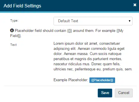
Default Text / Placeholder Variables
Text Area fields can include a default block of text that displays when entering an Activity record. This helps maintain consistent language across activities and guides users on the expected input. Default text can also include placeholder variables, which prompt users to replace them with specific values.
Placeholder variables are created by enclosing text in double curly brackets (e.g., {{variable}}), and they will appear to the user as editable fields when completing an activity in Field or Quality Control.
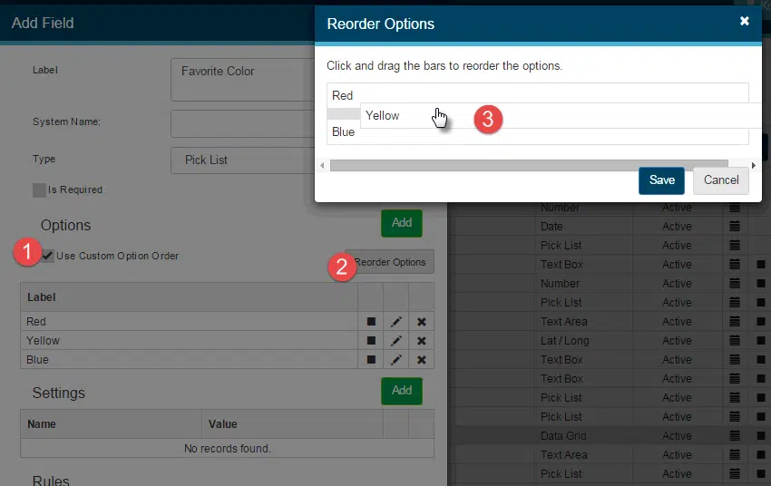
Reordering Multiple Choice and Picklist Options
By default, options in Multiple Choice and Picklist fields are displayed to users in alphabetical order. To customize this order, select Use Custom Option Order and then click Reorder Options. A popup will appear, allowing you to click and drag options into the desired sequence. This option becomes available only when a field contains two or more options.
Want to keep learning?
Click here for more how-to articles and MetaField guides. You can also access in-app guidance using the Help Desk!